Rebuilding a banking app around everyday money jobs
Introduction
Apelsin (the bank's previous name) started in 2019 as a payments app and grew into a digital bank with more than 1.5 million users in Uzbekistan. But churn was a growing problem. The app was spending money to acquire users who often didn't stay.
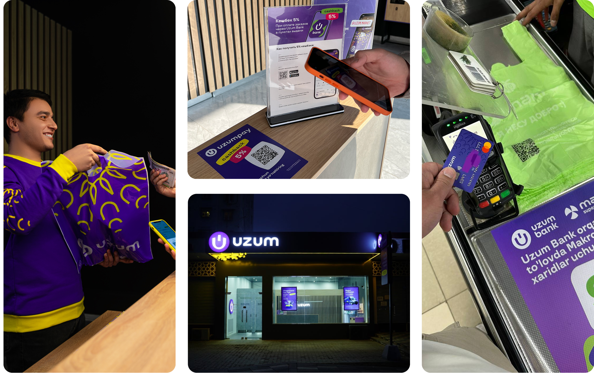
In 2022, Uzum acquired the bank and rebranded it as Uzum Bank. I joined shortly after the acquisition as CPO and Head of Design, responsible for the product direction. I owned the banking app and its integrations with the rest of the Uzum ecosystem.
Timeline
2022 - 2023
My role
CPO and Head of Design
Responsibilities
Product vision, UX and concept design, Hiring
Results in 12 months
In the first year, I took the product from scattered, one-off decisions to an aligned direction:
- Built the product and design team from zero to 7 PMs and 5 designers
- Set the product vision and aligned it with stakeholders and leadership
- Defined the core financial flows and turned them into concrete design concepts
The Challenge
The app ran on six years of UX built without a unified product vision. Features had piled up without a structure to hold them.
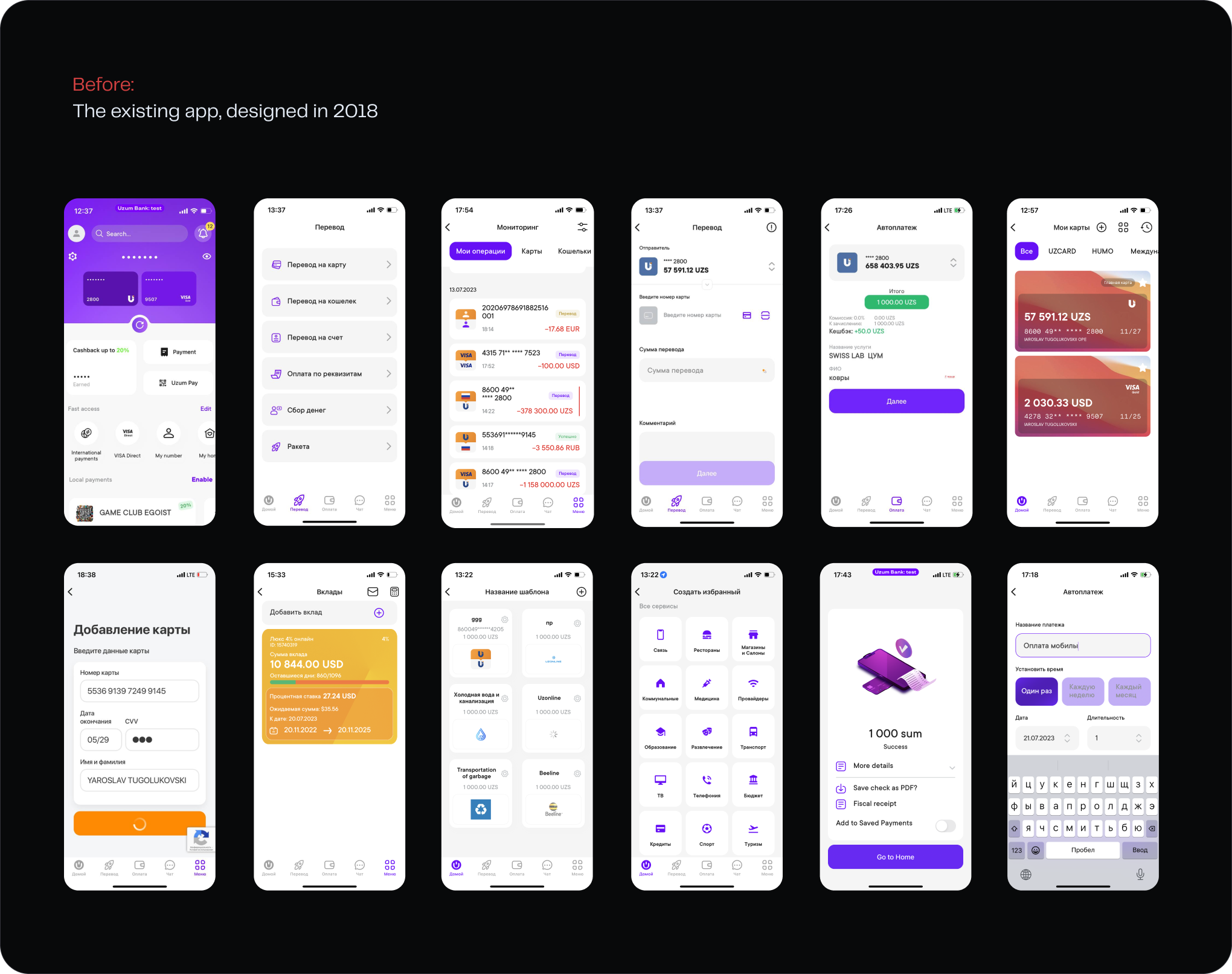
Churn was the expensive part. The app was spending money to acquire users who then left. I compared the churn spikes with what competitors were doing at the same time.
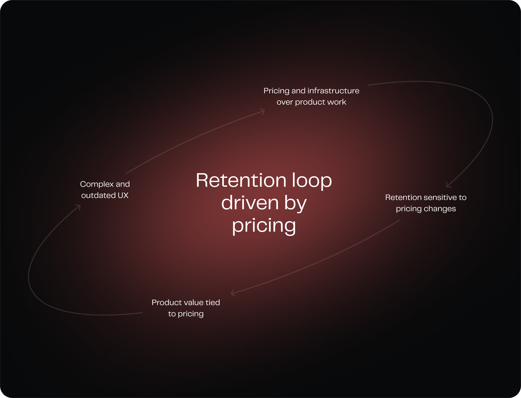
The pattern was clear. Users weren't leaving because of bugs or a bad experience. They were leaving when a competitor cut its fees by 0.5%. There was very little keeping them in the product once someone else offered a better price.
Finding the real problem
To understand what was going wrong, I mapped the main financial tasks people came to the app for and tried doing them myself. The problem wasn't that people didn't know what they wanted to do. They couldn't find where to do it.
Moving money between cards and between accounts followed different flows. Payment history was hard to find. Even within the right section, some related actions were split across different places.
The app had grown over time, and its structure reflected that. Features had been added where they made sense at the time, but there was no clear structure connecting them.
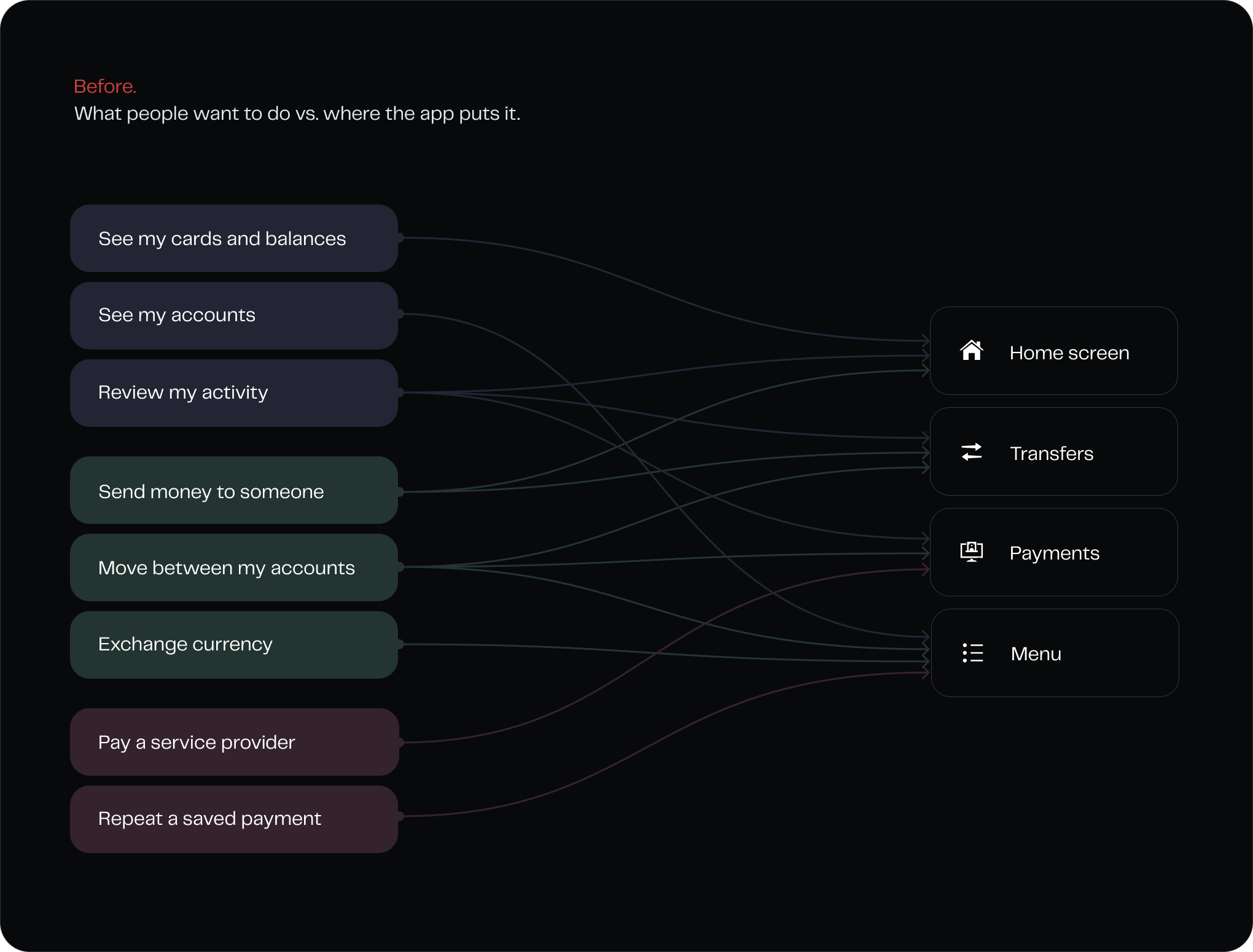
Most of what the app could do was hidden behind its structure. People used the things they could see, so their experience of the product was mostly about making transfers. And if that's all you see, there's not much reason to choose one bank over another except for the price.
That became the main principle for the redesign: the product should follow what a person is trying to do. We reorganised the structure around those tasks and rebuilt the flows around them, so the path from intention to action was clear.
The home screen, rebuilt around money
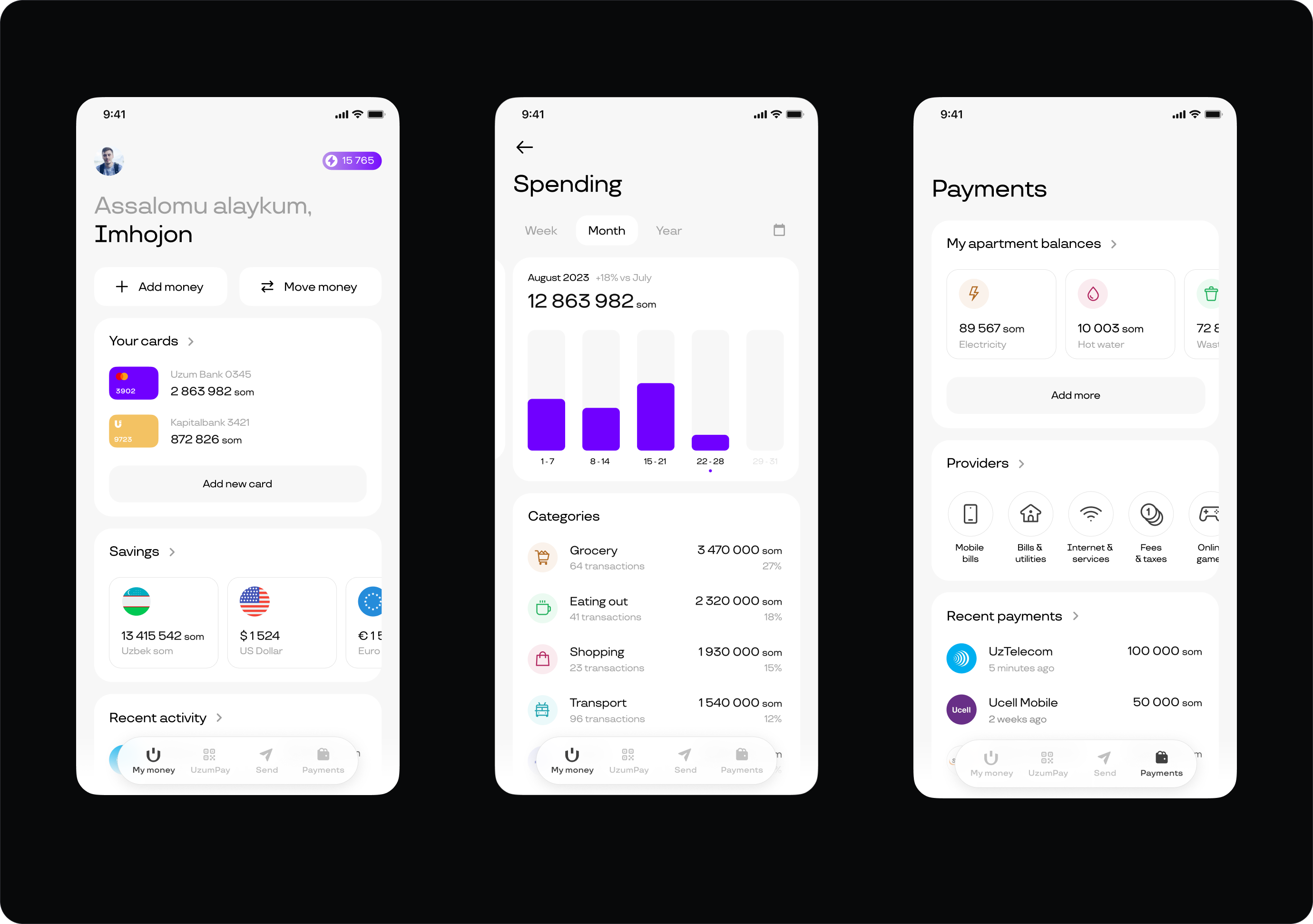
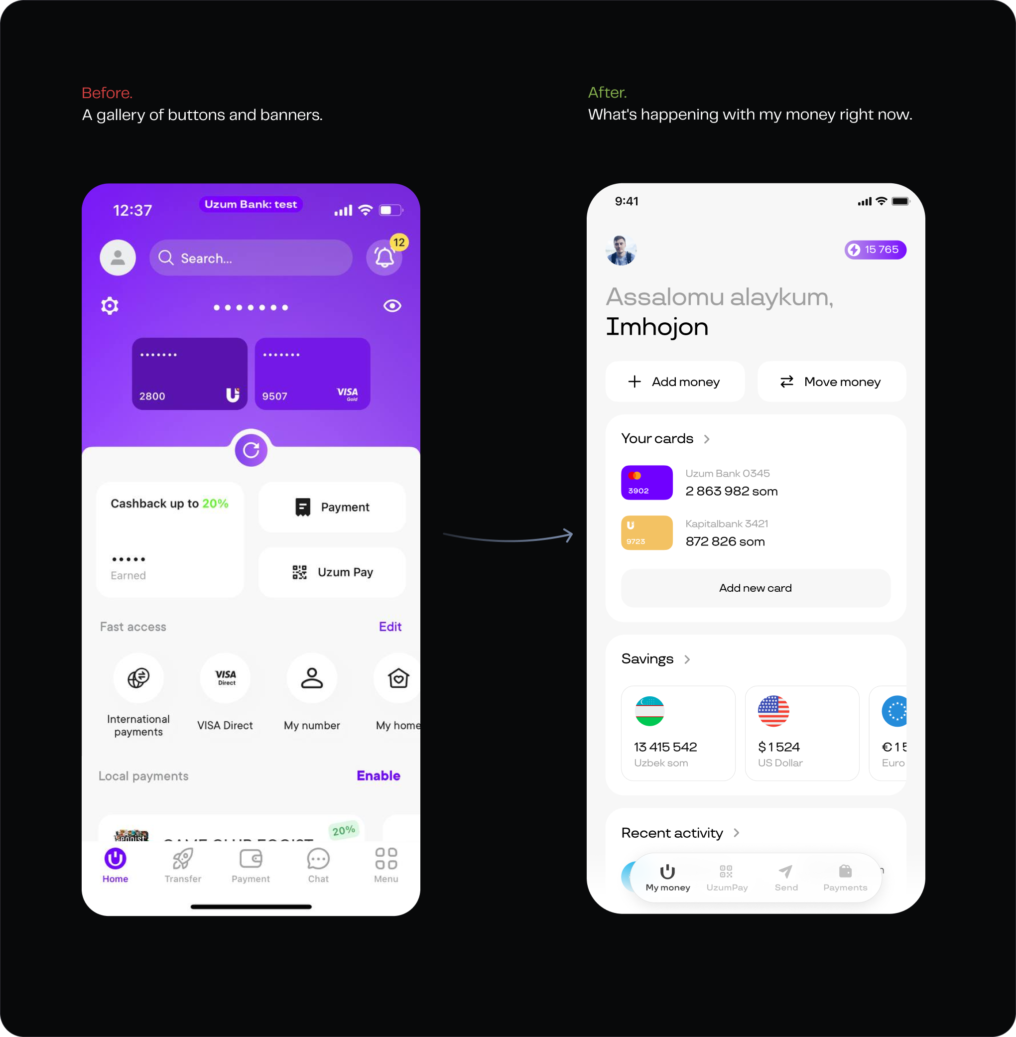
Features had been added wherever they fit, and the old home screen had become a collection of buttons and banners pointing people to different parts of the app. I rebuilt it around the user's money instead.
Balances, accounts, recent spending, and transfers between accounts, including across currencies, all live in the same place. People don't have to search through the app to find them.
The idea was simple: when you open the app, you should immediately see what's happening with your money. That's why I called the tab "My money" instead of "Home."
Move money as a single job
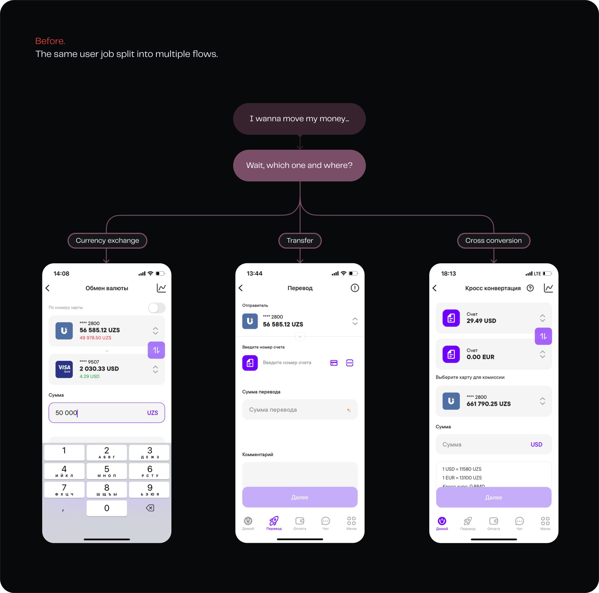
Engineering had built each type of transfer separately: cards, accounts, and currency. Each had its own backend, and the same split ended up in the UI. But users didn't care how the backend was structured.
Currency was the worst example. If the account you needed was in another currency, it simply wasn't shown in the list, with no explanation. You'd assume something was broken. Eventually, you'd find a separate currency exchange, convert the money there, then go back and start the transfer again.
Even the names showed the problem. One of the flows was called “Cross conversion”. I had to look it up myself to understand what it meant.
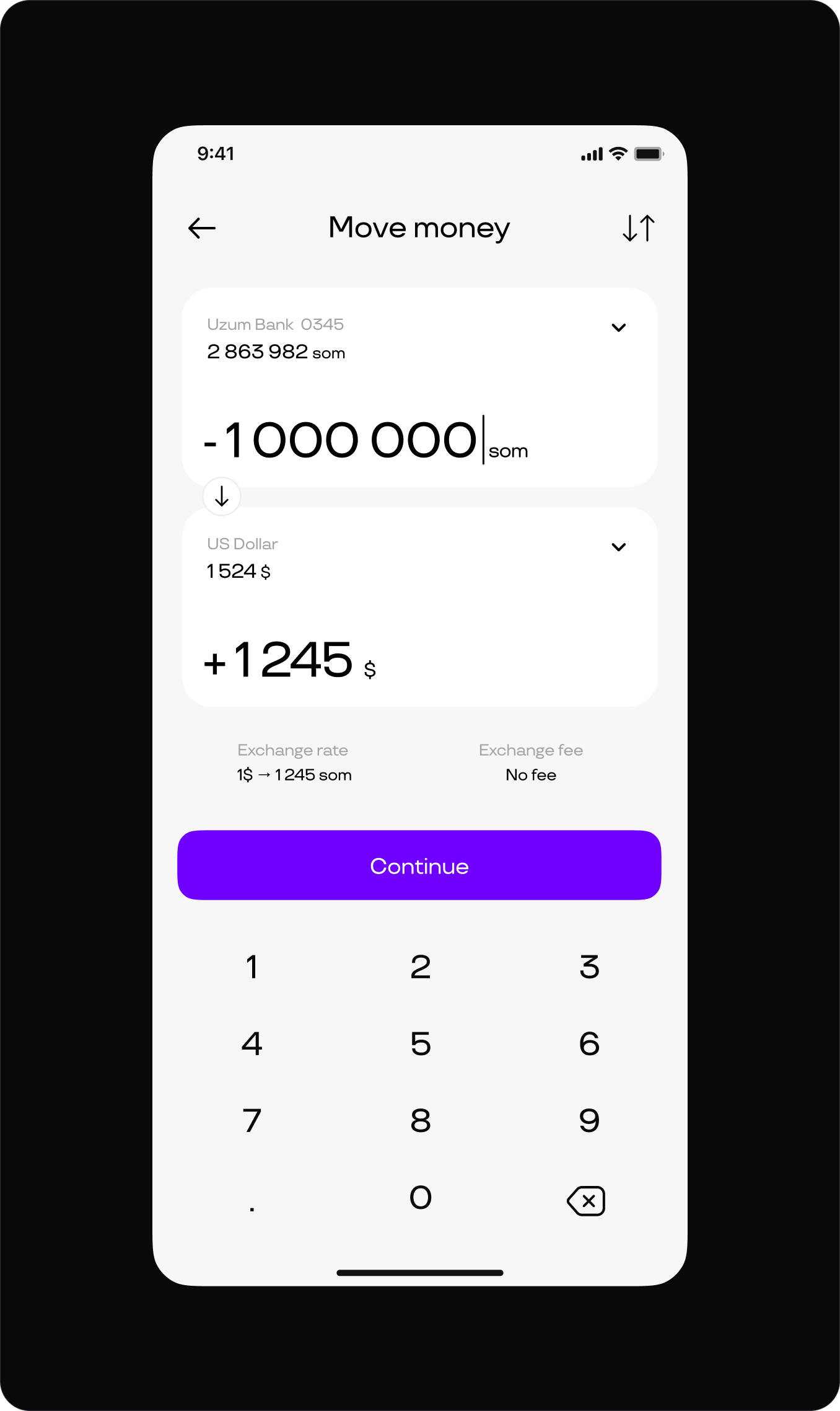
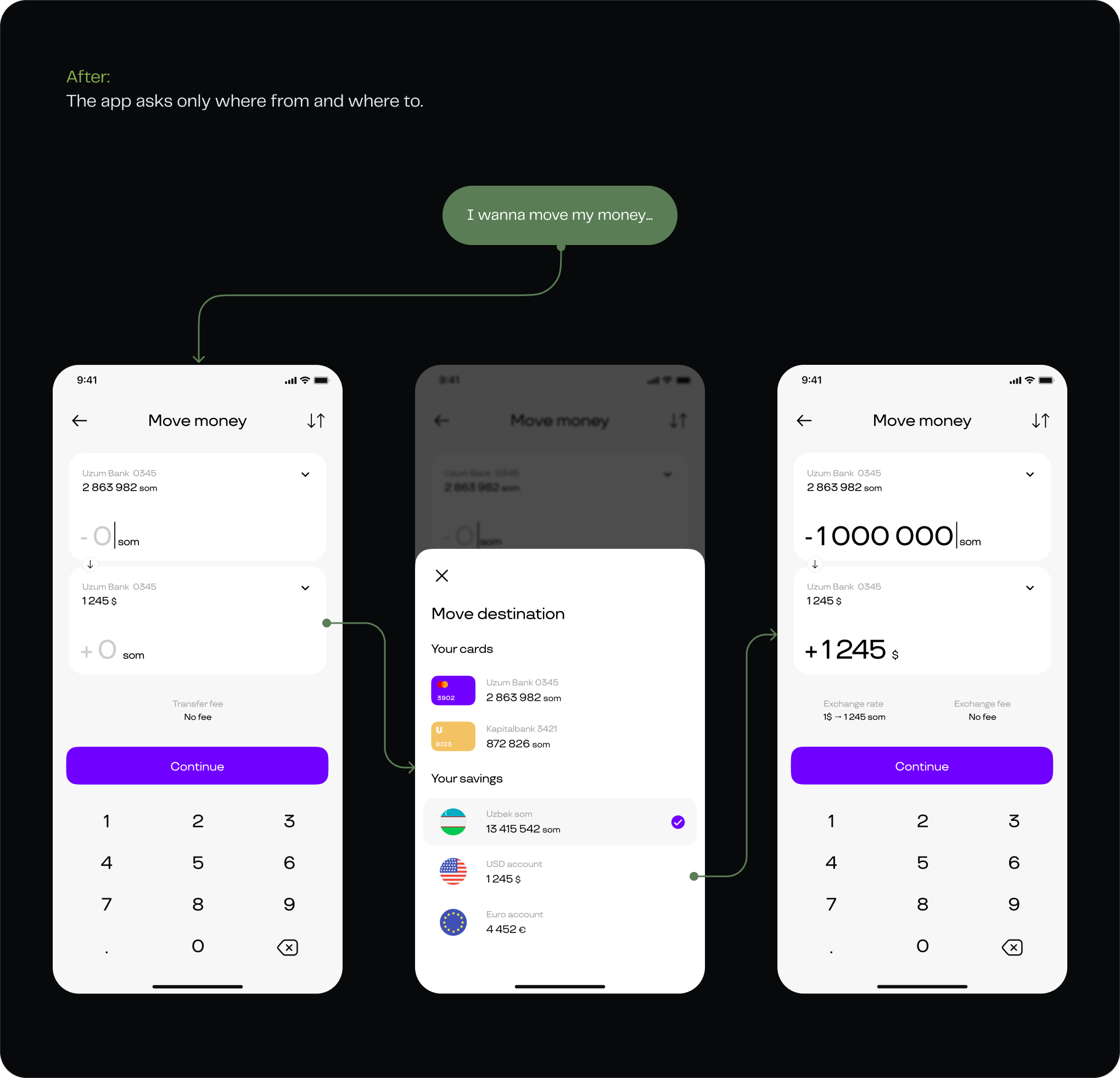
I rebuilt the flow around one simple intention: move my money. You choose where the money comes from and where it goes. If the currencies are different, the conversion happens right there, instead of sending you to a separate exchange flow.
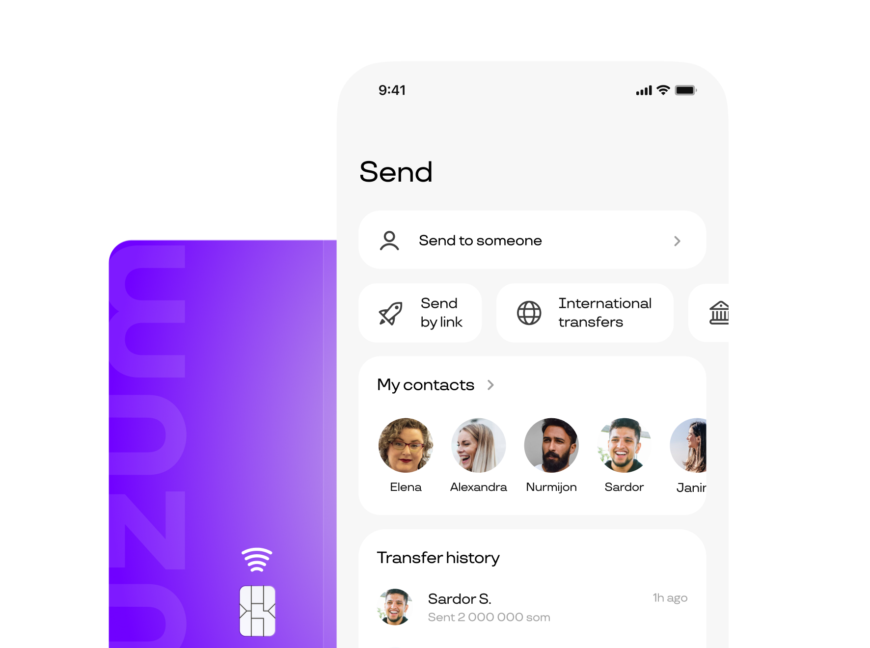
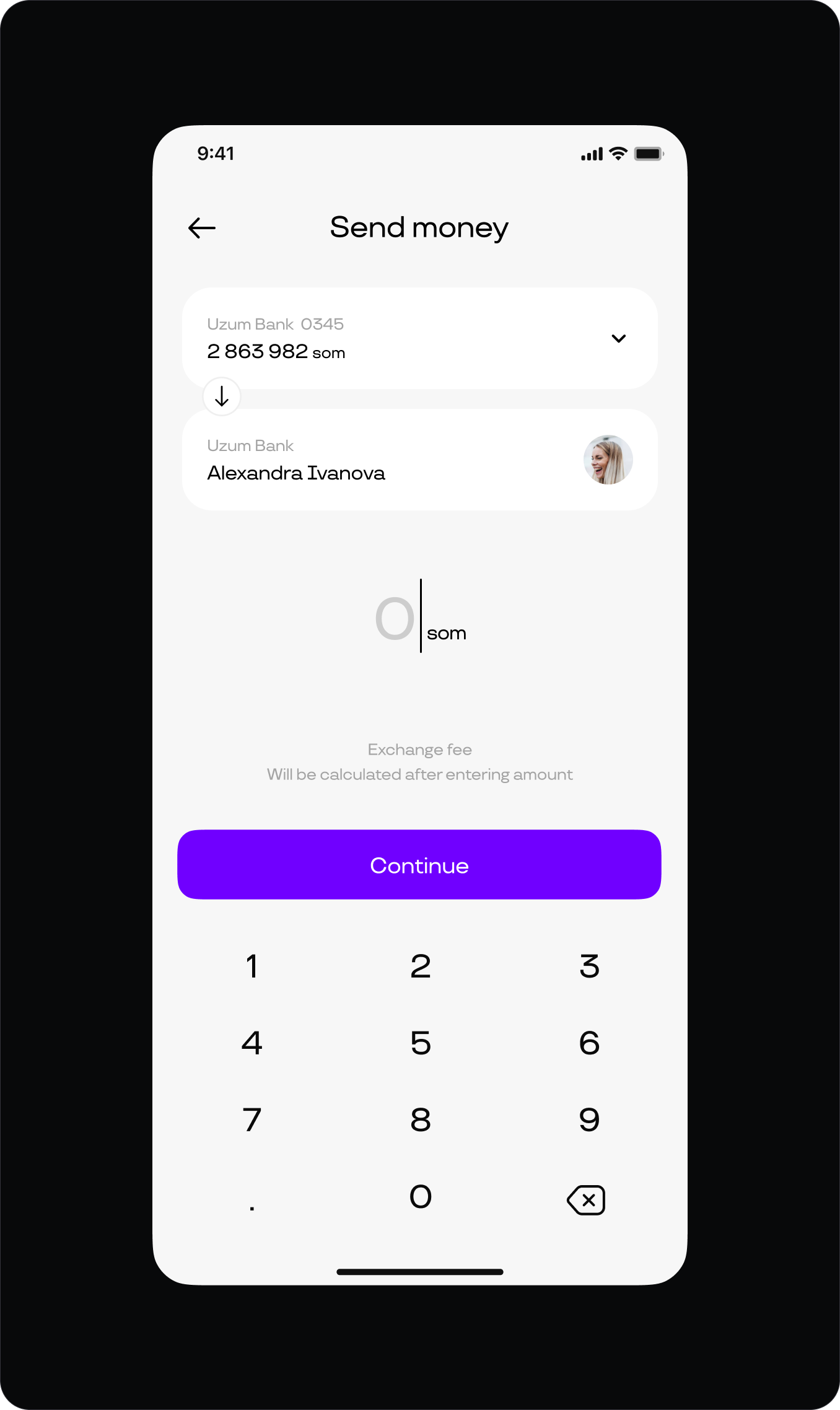
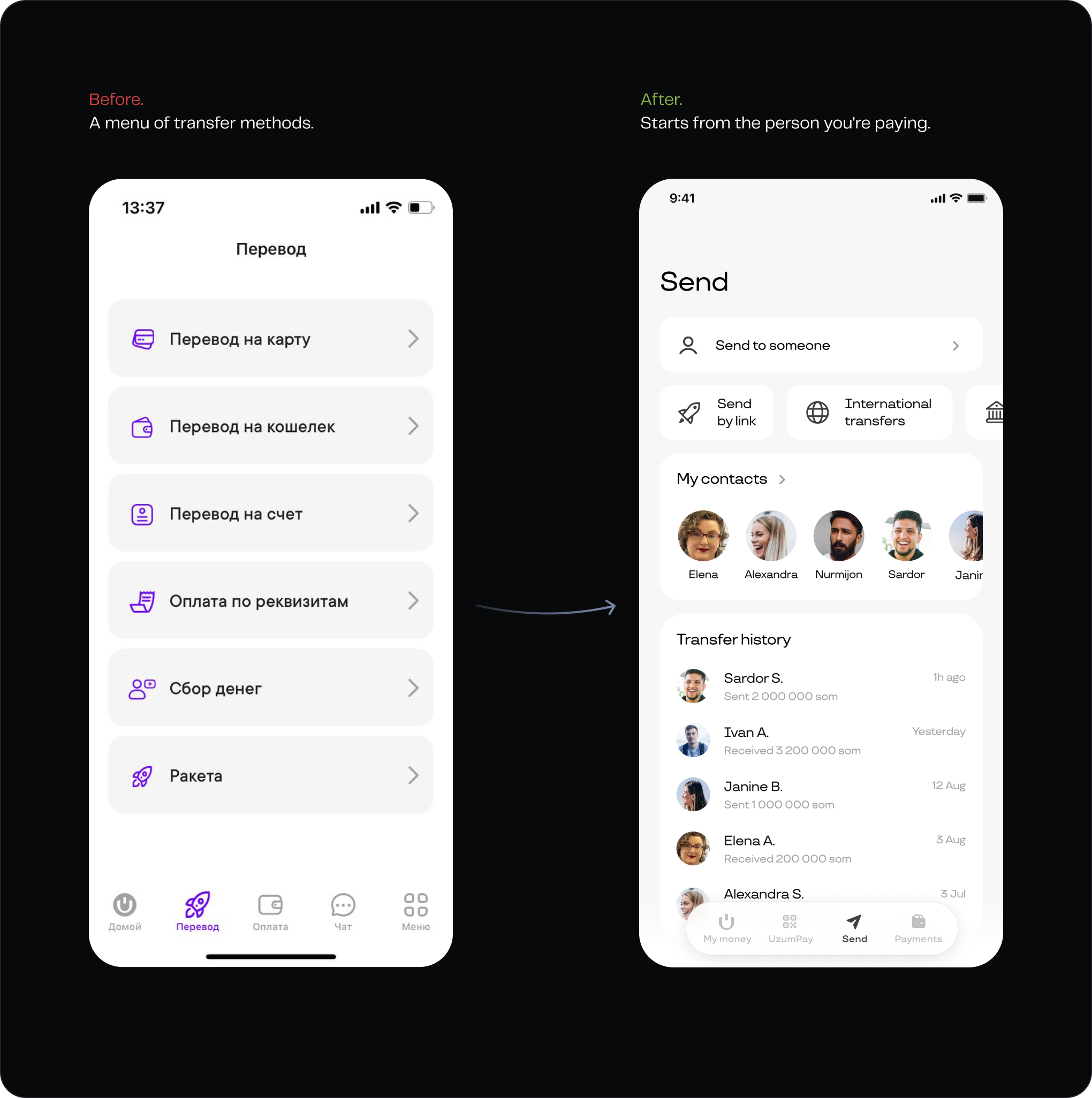
Send starts from the person
More than 90% of transfers were sent to other people using a card number. So I removed the transfer methods that each accounted for less than 2% of use and rebuilt Send around the person receiving the money.
The old screen started with a list of transfer methods. The new one starts with the recipient. One search field accepts a card number, phone number, or name and finds the person you're looking for. From there, sending the money takes just a few taps.
Utilities become balances
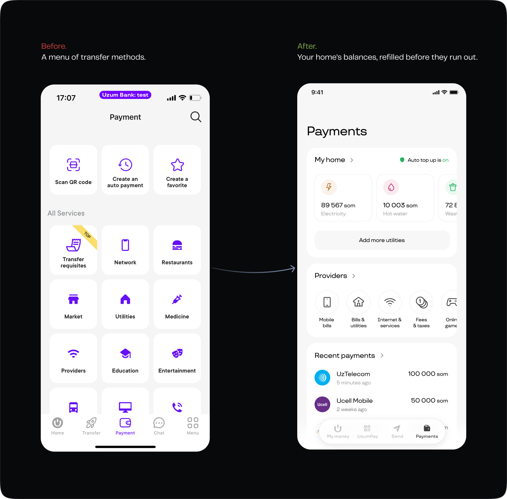
In Uzbekistan, utilities work on prepaid balances: you top up an account and the balance goes down as you use it. Banks usually treat these payments like any other bill: you find the provider in a catalog and then make a payment.
But for utilities you pay every month, people don't really need a catalog. They need to see their balances and top them up when needed. Since the providers already exposed the balance, I put that information directly on the screen: waste, hot water, electricity, and gas, each with its current balance in one place.
Epilogue
The vision and concepts were approved and became the direction for the next stage of the product. The team I built continues the work today. The design system and product principles are still in place, and new features are built on top of them.
The product continued to grow as part of the wider Uzum ecosystem. In 2026, Uzum reached a $2.3B valuation.